Visualizing News – Navigating Infographic Journalism in Shortform
21st December 2023
The landscape of news consumption and journalism is forever evolving as we are now in a new age of the digital era, where how we engage with current affairs has never been so different. Information no longer just flows through the pages of a newspaper or beats through the screens of our TVs; we can now view stories from single graphics – infographics and single pictures . Liam Daysh-Holmes investigates whether people are getting the full stories from this new style of journalism.
A study conducted by the United Kingdom’s broadcast regulator, Ofcom, found that Instagram, TikTok and YouTube have become the top three most used sources for news amongst teenagers and young adults, supplanting the traditional methods of consuming media which are newspapers and broadcast television. In the revealing report, the regulator added that many sources of news have seen a decrease in engagement since 2021.
This shift in how media is consumed represents a fundamental reimagining of storytelling in journalism - infographic journalism.
Infographics can distil complex data and ideas into visually bite-sized formats which make them easily digestible to audiences. With the average human attention span being merely 8.25 seconds, this visually appealing and scannable information condensed to a single graphic is very appealing to today’s tech-savvy consumers of news.
This is why Jack Kelly, the CEO of TLDR News, started his infographic-led news and media company. Jack found a gap in the market in 2017 whilst on a placement year at university in marketing. He found some channels in the US did explainer and infographic-style content aimed at younger people through social media but found there was nobody in the UK doing it successfully.
The visuals are a core element throughout the entire process.
— Jack Kelly, CEO TLDR News UK
Jack thinks that this style of journalism is important, and when speaking about traditional types of news. “People stepping back and paying less attention to news, and I think that disengagement comes from the fact that people feel confused and unempowered by news.”
He believes that infographic journalism and the style in which TLDR News outputs, it makes “the news suddenly becomes less scary and there's less reason to disengage.”
Jack said how TLDR News UK produce 20 pieces of content a week and has 12 employed staff. Each piece of content is produced in a two-day cycle with more than half of that time being focussed on animation and graphics. This highlights the importance infographics have on the TLDR News channels and the consumers, all 710,000 of them on YouTube and the other hundreds of thousands on other social media platforms such as Twitter and Instagram.
With this new landscape of news consumption and digital era, come unique challenges to social media journalism and especially infographic journalism - accuracy, reliability and accountability. Whilst traditional news outlets are held accountable to regulatory bodies and agencies such as Ofcom, social media led journalism aren't and Jack acknowledges this, saying how it is an “ongoing challenge”.

To make TLDR News more transparent and reliable as they are not held accountable by any regulatory body, Jack said: “We try and make sure during the process that we spend as much time as possible fact checking our own content, reviewing our own content, all of the graphics are double-checked and try to make sure that everything's accurate.”
But because there is no regulatory body to tell them when they are wrong, Jack said: “We try and make sure there's no errors, but there are errors, and our error-rate is probably higher than a mainstream outlet.”
So how do infographic media outlets ensure that accuracy is met?
We own up to them, we acknowledge them, we change things, we take things down.
— Jack Kelly, CEO TLDR News UK
At TLDR News, who also produce multimedia content, a biweekly podcast is produced titled ‘The Editoral’ where someone from the TLDR News team run through every mistake made in the previous two weeks and the ‘mistake’ will be assessed and discussed to decide if it was a mistake, explain it, how it happened and apologize publicly for it.
Whilst TLDR News hold themselves accountable for mistakes, some other infographic led media outlets on social media might not and when asked about the idea of a regulatory body be put in place for news outlets such as the TLDR brand, Jack said “There should be some kind of system, but if there were, it would have to be very careful to make sure that it didn't overstep.“
His main concern when it came to a system or body to regulate news that can't be held accountable by the likes of Ofcom was that he wouldn’t have been able to start TLDR News in the first place. He highlighted his concerns that “with real restrictions, real barriers, that then new independent journalists who are literally on their own in their bedroom, like I was, with no financial capital at all, just would never start. So you need to make sure that doesn't happen, but equally there are a bunch of bad actors in this space.”
Jack highlights the need for engaging graphics and visuals when making content but to exercise caution because they are still outputting news, journalism and information.
“It'll be really easy to fill a video if you didn't really care about whether the graphs were right, or if the maps were right, or whatever else, you could just chuck in a bunch of flashy graphics and it'll be easy, but because We're actually doing journalism,” he said.
He also touched on what the future of infographic journalism may entail, with a focus on Artificail Intelligence (AI). “It will never be good enough to actually write a full script in our style, with our tone, better than one of our writers could,” he says.
However, he strongly believes that it could be used for creating animations, graphics and thumbnails “Most of our video clips is pulled from Getty Images and we pay a set fee for every clip. Like AI could do that for much cheaper, or even free,” he said.
Jack stressed that he firmly believes AI doesn’t have the credibility for research and development in infographic content as most language models are not updated enough to include the latest information that a news site should be outputting.
He also touched on how unbiased an AI language model can be and how at TLDR News, there is concern around using AI for information as they believe “it's just not neutral and factual enough”.
Chuckling, Jack said: “Obviously AI doesn't have consciousness, so it's not consciously trying to be biased, but the biases off the Internet could lead it to present us with information that we say.”
Despite fears that information could be bias, how do news readers and consumers feel about the rising use of infographic journalism showing up in their feed?
I would like to see more infographic-based news than I currently do, as reading long text articles is difficult for me
— Brad-Lee Charlton, News Consumer
Brad-Lee Charlton , 23, a second-year student at the University of Birmingham where he studies liberal arts, says that he consumes news daily and mainly through social media.
Talking about his experiences with infographics in journalism, he says: “I think they are a useful tool in conveying news information. Having to make some myself during my studies, they are great at presenting and summarising complex information in an engaging format.”
Whilst he also said that he does not engage with infographics in his daily news habits, he finds them particularly useful when it comes to big events such as a general election or, in the past, Brexit.

One particular infographic that Charlton distinctly remembers was crafted by the BBC to break down the Brexit process. The graphic in question not only outlined the various pathways available to politicians but also provided a comprehensive overview of the events leading up to the crucial moment for the UK.
What set this infographic apart, according to Charlton, was its exceptional clarity which he says he would not be able to get from a complex article about Brexit, an already complex movement. It clearly distilled the information from numerous lengthy articles into a digestible format, making it easily comprehensible for readers.
He said: “What stood out about it was its clarity - it had summarised the events spanning multiple, lengthy news articles into something simple to understand and process.”
Charlton's perspective underscores the value that infographics bring to the world of journalism. Through their ability to distil complex information into visually appealing representations, infographics encourage readers to navigate confusing news stories with confidence and clarity. This powerful tool increases the accessibility to news, creating a sort of path to understanding current affairs in this information saturated world.

Charlton also shared his perspective on what makes an effective infographic. He thinks that a good infographic must have two key ingredients: clarity and conciseness. Emphasising the importance of avoiding information overload.
"For a news article intended for the general public, a lack of jargon would benefit," Charlton added. He stressed the need for infographics to be accessible to a wide audience, ensuring that even those without expert knowledge can grasp the information presented. Moreover, Charlton emphasized the necessity of including cited and reliable sources within infographics.
Infographics are often perceived as more accessible forms of journalism, as people with dyslexia and other disorders can consume them more easily than traditional forms of media.
Users can face potential challenges in interpreting or navigating infographics, with Charlton experiencing this through colour-blindness.
“I can find it difficult to navigate certain infographics that rely on colour to convey information," he explained. This insight sheds light on the importance of considering accessibility in infographic design, ensuring that visual elements are complemented by alternative means of conveying information.
He added that when consuming news there are specific types of information that he would prefer as traditional text, saying: “I think that interviews are better off as text, rather than infographics.”
Charlton's perspective provides clarity and guidance for journalists and infographic designers - By prioritizing clarity, providing reputable sources, and considering accessibility, infographics can evidently serve as powerful tools in conveying complex information to a widened audience. In an era of information overload, this insight from a consumer offers clear advice and preference for readers for - Enhancing the effectiveness of visual storytelling in news articles.
Charlton also acknowledged the rise in short-form content in journalism with his habits of consuming news online, especially through social media and said: “I feel infographics could rise in popularity as a way to compete on these platforms because of their ability to summarise information.”
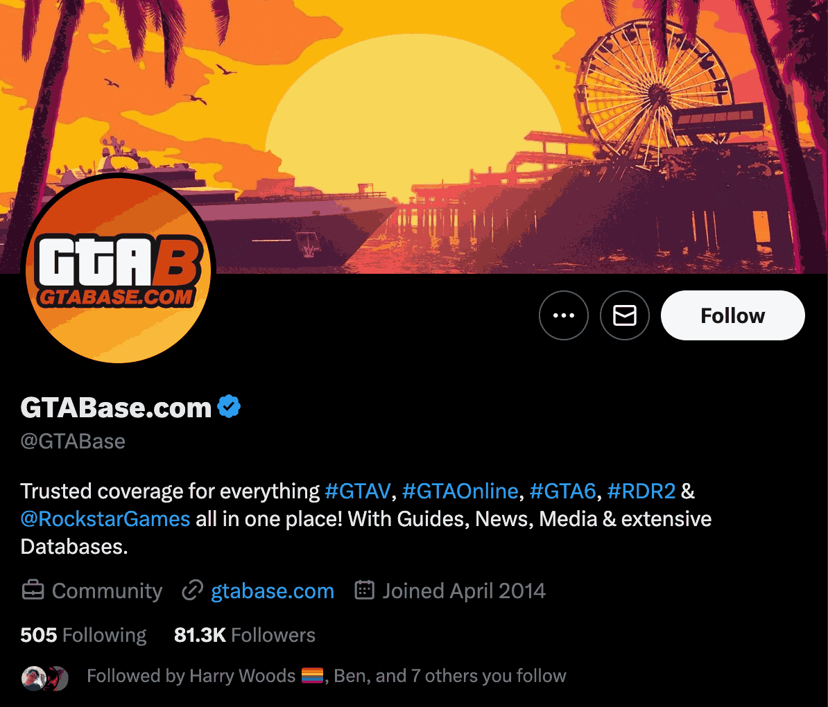
Journalist Ryan Young specialises in social media and shortform content and lends their expertise to the widely regarded content platform GTABase.com, with a following of 75,000 followers on X (formerly Twitter). Young provided insight into the strategies to captivate and inform audiences within the fast-paced world of short-form journalism. Their perspectives shed light on the relationship between concise, visually engaging content and the need for information.
They do not believe that infographic journalism is wholly the way forward, linking their experiences in the industry of news in gaming.
This can be accredited to the lack of quantifiable data. Whilst infographics are great at presenting data and informative content in bite-sized, easy-to-consume formats, gaming news is often “information about gameplay experiences, reviews, or storytelling elements may not translate well into an infographic format.”
Young emphasized the importance of audience engagement in news and journalism, especially within the gaming community. This is an area where infographics may fall short, as they can sometimes restrict the avenues for reader interaction. Infographics, by their nature, often present information in a straightforward manner, leaving little room for open discussion or debate.
“At the end of every article I write, I always feature a call to action to give us feedback on our Twitter, and link back to it,” Young said when discussing the importance of engaging with your audience, something you cannot really do with infographics.
Twitter has been known as the world's town square for so long, and having our little stall in the square was working wonderfully for us
— Ryan Young, Gaming Journalist
However, as an advocate for short-form journalism as opposed to infographics, Young said they are worried about the future of their news outlet and other sources of short-form journalism, specifically on Twitter.
Due to constant policy and algorithm changes on Twitter, Young believes that short-form content is being pushed down the algorithm and that pictures with infographics are being pushed up. Because of this, sites such as GTABase.com that share their content on Twitter are getting less engagement and less traction.
So maybe some sites need to adapt how they output their news to what audiences and algorithms prefer to survive?
The Reuters Digital Report 2023 for the European Federation of Journalists, titled ‘Media outlets need to adapt to new generations’ focused on how people are now consuming news trends and online engagement. The report provided insight into a rise in prevalence of ‘vertical videos’ and news podcasts – both of which often use infographics to convey a story with this sort of content being uploaded to social media which have strict limits on the length of content that can be posted.
Adding on to the rise of younger people consuming news through social media, the report says “news outlets need to find new ways to keep up with the demand. The media landscape is transforming towards a digital, mobile and platform-dominated environment, following the demand of younger consumers. Audio and video are gaining traction.”
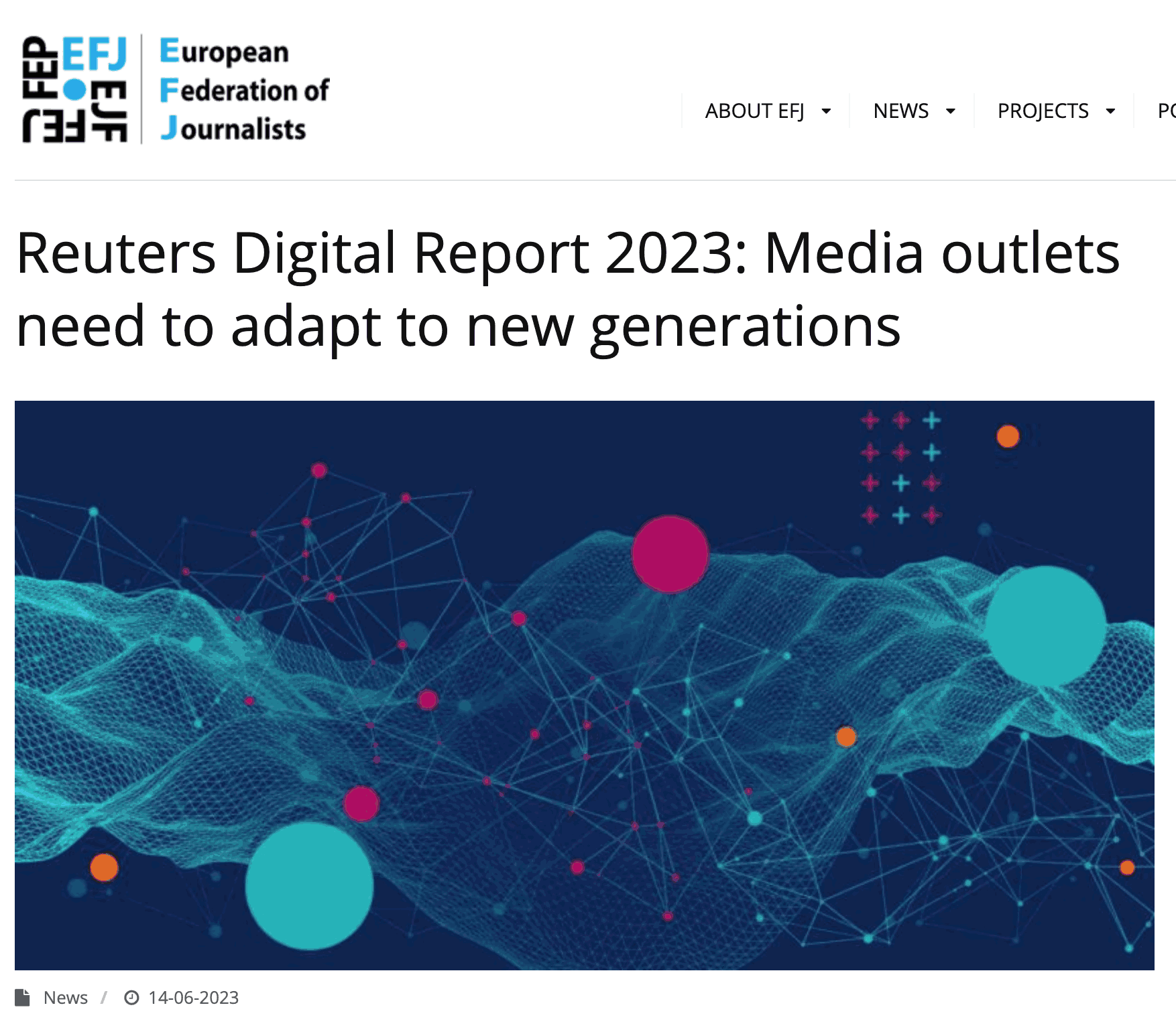
The Reuters report also stated that “the news media world needs to adapt to this new trend, and publishers will need to optimise the use of these intermediaries to drive new users.”
This is not the first-time journalists have had to adapt to the everchanging landscape of journalism.
Reflecting on her extensive career in journalism, Ruth Peacock, a former BBC journalist, observed the transformative evolution of the industry, including the incorporation of visual elements like infographics.

She recalls when online journalism started in the 1980s and when she was at BBC Television Centre, it was decided that all journalists, online, TV and radio would have a closer working relationship with each other, which meant they “would be expected to have the skills that they could move around the different desks in the newsroom. So, we come to the position now where everyone does everything.”
Highlighting the importance of social media journalism and graphics, Peacock said: “The picture tells the story to some extent, depends on what the story is. So today when we have got reshuffle in the cabinet, you have the picture of David Cameron, surprising everyone by getting out of the taxi. And that is the story.”
The experienced journalist says how in her current position as leader of the Religion Media Centre, an impartial media outlet which aims to consult journalists and media professionals on how they cover religion. She has said how she produces her own infographics but highlighted the importance of getting her statistics and information from peer research.
Peacock added: “The problem is, of course, that a graph can be drawn in such a way that it tells a different story to the one that you're wanting to convey, or it warps the story.”
Laughing about her experience in the BBC, Ruth reminisced about when they first started using infographics at the Television Centre. “We had a greenscreen studio so that a reporter could stand in it and there would be graphics going on. He or she would be outside 10 Downing Street and blobs would come up from the street outside, showing statistics,” she said.
“And although it hooked an audience, that was thought to be very tacky by some people in the newsroom.” She then went on to say how infographics can easily tell stories more concisely.
I'd say, yes, it hooks an audience, so I wouldn't rule it out
— Ruth Peacock, Ex-BBC Journalist
Whilst Ruth believes infographics do provide valuable hooks to audiences, and can sometimes turn a story what might be 3200 words into a single image or graphic, she also stresses that readers should exercise care that they are getting the whole truth and the whole story
“Be careful that a graph does not misrepresent the truth,” she said “Be careful about what statistics you read and ask questions about whether you can trust the organisation distributing what you are reading.”
News consumption and journalism are currently undergoing a profound transformation and the emergence of infographic journalism stands at the forefront, changing how audiences engage with information. This dynamic shift reflects a swift change from conventional news sources towards visually compelling, condensed narratives that cater to the evolving preferences of a tech-savvy audience.
Infographics have emerged as a powerful medium, capable of distilling complex data and narratives into visually appealing formats. This accessibility resonates profoundly in a world where attention spans are fleeting. Yet, this evolution is coming with new challenges, particularly concerning accuracy, reliability, and accountability in the social media space which is largely unregulated compared to traditional news outlets.
Jack Kelly set out to change how young UK audiences consumed news, making it less intimidating and more accessible. Despite, impactful engagement with audiences, the absence of regulatory oversight poses an ongoing challenge, prompting the need for potential heightened vigilance, accountability and regulation within infographic journalism and the realm of social media.
Insights from individuals like Brad-Lee Charlton, a university student engaging with infographics in news, highlight the value these visual tools bring to help casual news readers distil complex stories, events, and narratives, like Brexit. Charlton's emphasis on accessibility highlights key criteria for effective infographic journalism. His insights from a news readers perspective shows that journalists need to understand that whilst infographic and social media journalism might be a way forward in the digital age. There is still a need to upkeep accuracy, accessibility, and reliability, these should still be at the forefront of ‘good journalism’.
However, as the industry continues to evolve, experts like Ryan Young expressed caution and reluctance to overly relying on, especially in some fields of journalism where infographics may not translate well. While infographics excel in data presentation, certain narratives, such as gaming news, may not seamlessly translate into this format, limiting interactivity and nuanced discussion.
The need for adaptation and innovation has been a consistent theme in journalism's evolution. Ruth Peacock's reflection on the integration of infographics into journalism throughout her career underscores their role in captivating audiences. However, she also urges caution, focussing on the potential for misrepresentation and the necessity for readers to scrutinize information sources diligently.
In this ever-evolving landscape, the use of infographics as a storytelling tool to give people news cannot be relied on to wholly shift the world of journalism. While they offer captivating narratives, readers must remain weary, acknowledging both the strengths and limitations of these visual elements. Infographic journalism may appear to be a test to how news is now consumed, but its true power lies in a balanced approach—one that prioritizes clarity, accountability, and accuracy, as we found out that these three vital elements of journalism cannot be guaranteed in some infographics we see on social media.
As journalists navigates this transformative era, the fusion and integration of visuals and information in infographic journalism has altered the news landscape. Demanding that both creators and consumers change their habits when it comes to creating and consuming news – But a clear message remains; To stay cautious, and to always prepare for further change.