
This article has been created for teaching purposes: WordPress Pictures
One production issue which lets down many articles submitted as part of portfolios is poor use of pictures. We know we want to create engaging professional looking content to get the strongest marks. Look at the way national publications present pictures in their posts:
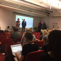
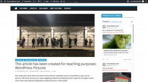
Look at the way this piece was presented during a newsday:
Canterbury underpass gets new look
Both pieces integrate the pictures into the post, leaving little white space. The Mirror’s approach means images do look big on a desktop – but more and more of their audience is on mobile. Try looking at the link from your mobile device.
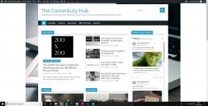
This is what a 200px x 200px picture looks like in a post:

This is test copy used for teaching purposes. This is test copy used for teaching purposes.
This is test copy used for teaching purposes. This is test copy used for teaching purposes.
This is test copy used for teaching purposes. This is test copy used for teaching purposes.
This is test copy used for teaching purposes. This is test copy used for teaching purposes.
This is what it looks like centred, lots of white space either side 🙁
This is test copy used for teaching purposes. This is test copy used for teaching purposes.
This is test copy used for teaching purposes. This is test copy used for teaching purposes.
This is test copy used for teaching purposes. This is test copy used for teaching purposes.
This is test copy used for teaching purposes. This is test copy used for teaching purposes.
This is test copy used for teaching purposes. This is test copy used for teaching purposes.
This is test copy used for teaching purposes. This is test copy used for teaching purposes.
This is what it looks like if we choose “align left”. The copy wraps round it a bit but not still ideal:
This is test copy used for teaching purposes. This is test copy used for teaching purposes.
This is test copy used for teaching purposes. This is test copy used for teaching purposes.
This is test copy used for teaching purposes. This is test copy used for teaching purposes.
This is test copy used for teaching purposes. This is test copy used for teaching purposes.
This is test copy used for teaching purposes. This is test copy used for teaching purposes.
This is test copy used for teaching purposes. This is test copy used for teaching purposes.
This is test copy used for teaching purposes. This is test copy used for teaching purposes.
This is test copy used for teaching purposes. This is test copy used for teaching purposes.
We can drag a 200px x 200px image out to make it fit the width. But because we started with a tiny image (tiny in both height and width and file size 29kb)
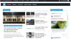
And this is what a 200px x 200px image looks like on the homepage if we use it as a feature image:
There are a couple of things we can do:
– Make sure we start with the biggest possible file sizes for images. Screen grabs tend to give very small file sizes. So taking original images or sourcing high quality images for which you have copyright permission is the best approach.
– If we have to use a small image we need to put it on background to avoid the white space.
Here is an image which has come straight from an iPhone and been put into this post. Much better right?
Well, no, it is a big image 2MB and 4032 x 3024px. This image will take longer to load on mobile devices. Even with 4G. Remember, one of Google’s most important SEO ranking factors is page load time.

This is the same image but it has been put through Photoshop and optimised and resized for use online. It is now 650 x 450px and just 47KB. Much easier on your data charges – can you see much difference?

If we really have to use a small image – one which is 200 x 200px for example – then we can use Photoshop to put it on a background which is wider or combine it with other images.
Like this:
Next let’s fix the feature image problem. Remember, if we use a small px sized picture as the feature image, it doesn’t look great.
Now I have added an optimised 800 x 600px version of the image as the feature image. Which looks like this on the homepage:
And this in the article (post):
These common problems can be fixed with a few simple processes in Photoshop.
In the Learning Resources folder of this module’s Blackboard, there is a Photoshop folder with a number of tasks, guides and resources.
Now it is your turn.
You need to resize and optimise this image so it looks like this:
And show you can produce this image:

And this one: